News
Why A Red Electoral Map Isn't As Scary As It Seems
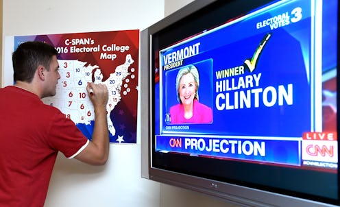
Visual aids, like the vivid red and blue electoral maps on every news source right now, are supposed to help you understand data more easily, but sometimes looks can be deceiving. If watching the maps update tonight is making you nervous, then these red maps of Obama's 2012 win could help ease your 2016 election anxiety. The United States is a very big place, and the way the presidential election works can mean that a whole lot of red on the map actually doesn't turn into as many electoral votes as it seems like it would.
But first, a quick refresher on how the electoral college works. Each state gets seats in the United States elector college, and its number of electors is equal to its number of members of the House of Representatives (whose seats are doled out in proportion to match the relative populations of the states) plus its number of Senators (each state has two). All but two states function on a winner-takes-all system, giving all of their electoral votes to the electors of the party whose candidate wins that states's popular vote (even if it's by a small margin).
Some parts of the United States are way more densely populated than others. Though they look very red on the maps when their results turn Republican, fewer electoral college votes are on the line than for some of the smaller (often bluer) states. Think of small, blue New York (29 electoral votes) vs. large, red Montana (3 electoral votes).
This sobering consideration comes to us via some timely tweets reminding us about how red the maps looked when President Obama was elected in 2012.
See all that red? Lots and lots of red. Nice little reality check.
After all, since we basically have a two-party system, and because people disagree on many things, it's really hard for an American president to win in a landslide. That means many citizens will have always voted the other way. They live somewhere, and those places turn red on the map. It doesn't mean defeat until the electoral college numbers add up.
For these electoral maps to be totally straightforward and no longer misleading in this way about the electoral importance of each state, they'd have to be redrawn with the states incorporating areas that reflect their population and elector counts. But that'd look weird and, well, they wouldn't really even be maps anymore. So you'll just have to keep the maps in perspective.
Image: Giphy
