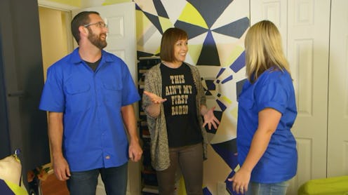
The early 2000s home makeover show, Trading Spaces, has returned to TLC, and so have the brightly-colored, matching button-ups of its participants. Although the show offered some design perspective and family-friendly entertainment at the time, it's no match for the refined design aesthetics of today's viewers.
Thanks to improved makeover shows that have aired over the last nearly-two decades, including the hit HGTV show Fixer Upper, fans have learned a lot about big and small ways to transform a space — and that trusting a neighbor, who isn't a design professional, to know your style and vision maybe isn't the best idea.
On Trading Spaces, participants are given a budget of $2,000 to revamp one room in a neighbor's home over the course of two days. In the first iteration of episodes, participants haven't used their budget as wisely as they could've, pillaging their funds by spending them on unnecessary trinkets and decorations to adhere to some type of impractical theme. One pair ended up with a living room floor full of sand as an attempt to recreate a tropical paradise, and another was shocked (in the worst way) to find bits of straw glued to their walls after asking for a kid-friendly space. Don't get me started on the trend of painting ceilings that ran throughout the show's first installment — just no.
I wish I could say that the show has made a jump toward modern tastes with its reboot, but so far, it has reported otherwise. The first episode took two livable, but plain open spaces and transformed them into smaller-looking rooms with dated themes that were inspired by penguins and Hawaii.
Designer Douglas Wilson painted the ceiling brown and covered the walls of the Hawaiian-themed room with burlap, closing it in on itself and creating lots of opportunity for shedding. It was a step away from straw-covered walls, but not necessarily a good step.
The penguin-themed room was channeled a "deconstructed penguin" (ew?) and was decorated with hollowed-out egg shells. Although that may not be as distasteful as sand carpeting, it still made for a tacky end result and an attempt at artsy gone wrong. The owner of the room offered a horribly awkward, guarded reaction as an attempt to appease her sister, who helped design the room. She said, "I appreciate the work that went into it," when she opened her eyes for the big reveal. Can you say, "Yikes?"
Is it true that Trading Spaces helped carve the path to success for the home renovation niche that exists today? Absolutely. But the niche has evolved far past themed rooms that will outdate themselves in no time, cheap decorations, and inexperienced designers. Thanks to experts like Chip and Joanna Gaines, home improvement enthusiasts of today better understand how to stretch a small budget farther than just two rooms, and they can settle for no less than a cohesive, clean floor plan, just the right amount of mounted shiplap, and antique flea market finds hand-picked by Joanna herself.
I have a feeling that sweet Joanna wouldn't lose hope, however, and would encourage Trading Spaces cast members to keep working at their design aesthetics. After all, she admits the decor in her first house was not Fixer Upper material. "I was experimenting with my design style at the time and every room had a different theme," she told POPSUGAR. "The living room was nautical themed with cheap sailboats and prints as decor. The kitchen was French themed with horrible mustard-colored walls. The den was cowboy themed for Chip, of course ... horns, leather, and lots of cedar. It was all very interesting, to say the least."
But, hey, if Joanna came from cheap sailboats and mustard-colored walls, maybe there is hope for future episodes of Trading Spaces.