Books
The Twitter Feud Over This Judy Blume Cover Actually Sparked An Important Conversation

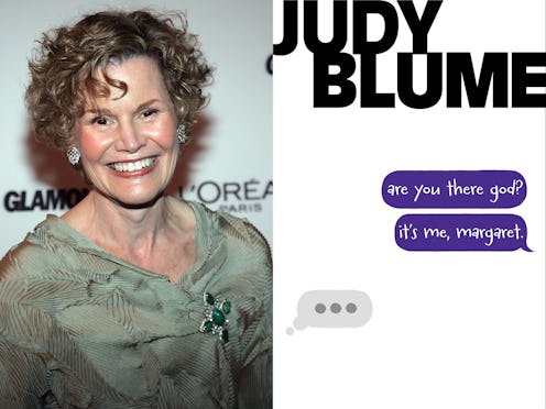
As someone who grew up in the '90s, I fully understand the impulse to fall into all my extreme nostalgia feels. And with that comes the desire to trap all of the pop culture we consumed during our youth in amber — to preserve the cartoon characters we loved in their familiar outfits and ages, to listen to our beloved songs un-remixed, and most importantly to many readers, to keep the book covers on our shelves looking exactly the same for all eternity. At least, that seems to be how a lot of people felt when a redesigned cover of Judy Blume's seminal YA novel, Are You There God? It's Me Margaret became the latest minor Twitter controversy when it was called out for its decidedly modern theme.
"What have they done to Judy Blume this book was copyrighted in 1970" read the tweet posted by Twitter user @JessicaHuseman — and it garnered over 1400 retweets and almost 8000 favorites, plus plenty of comments from users speaking out against the redesigned cover.
Despite the fact that the original tweet in question was later deemed "mostly a joke" it still started an interesting conversation about redesigning classic covers for a new generation. For some background: Are You There God? It's Me Margaret was first published in 1970 and follows Margaret Simon as she comes of age and begins to question everything from religion to boys, bras, and first periods. On the new cover in question, Margaret is having one of her conversations with God via what appears to be iMessage.
In a post published on The Cut about the tweet controversy, Amanda Arnold writes, "While the art team behind the cover was clearly trying make it into something that kids these days would relate to, the design feels severely off, perhaps because the book was published decades before texting — let alone iMessaging — was invented."
But... that's exactly the point. iMessaging wasn't invented in 1970 when this book was first published, and so the audience that this book was hoping to reach almost 50 years ago would have been definitely been confused by those three "still typing" dots we've all become so familiar with in 2018. But the young people who read Are You There God? in 1970, and 1980, and even 1990? Well, this book just isn't for them anymore. It's for 11 and 12 and 13-year-olds who are struggling with the same issues Margaret was back then — just with iPhones in hand.
Laura Sebastian, author of the YA fantasy novel Ash Princess took to Twitter to express similar thoughts on the cover outrage:
Again, I'm the first to admit that I am a sucker for all things nostalgic. I love my old-school Ann M. Martin's Baby-Sitter's Club covers, with the girls all in fabulous 80s attire, sitting around a landline telephone, waiting for business calls. But the simple and undeniable fact is that that those covers probably wouldn't speak to a third grader today. In fact...they would probably make them lose interest entirely. That's why Blume's covers aren't the only classics to go through this overhaul. The Baby-Sitter's Club books got updated treatment, too — with both new covers for the first seven novels and an entire new series of popular Raina Telgemeier graphic novels inspired by the original stories. The people who redesign these classic covers understand the need to bring these stories into modern day, and take their audience into consideration when reconfiguring the covers.
In 2014 (when the Simon & Schuster redesigned covers of Judy Blume's classics first hit the shelves) Constance Grady interviewed the illustrator Debbie Ohi, editor Justin Chanda, and cover designer Lauren Rille for an article in Vox, where it became clear that the "the pastel-hued photorealistic covers of the ’70s, ’80s, and ’90s" just weren't going to cut it for today's teens in a market where bold colors, modern fonts, and minimalist graphics are key.
And Judy Blume herself agrees.
"Judy was very specific about one thing: These should be books that kids today would pick up," Chanda is quoted in the article. "She was not looking for nostalgia, but rather books that middle grade kids today would be drawn to."
Basically, in order for a story to truly stay alive, we all need to let go of the vice grip of nostalgia. Because the stories inside — of puberty, periods, first love and heartbreak, finding yourself amid family upheaval and new friendships — are what really matters, respackaged covers or not. Because adolescent angst? That never goes out of style.