Fashion
Burberry's Brand New Logo Is Basically Unrecognizable
It's not everyday that a major fashion label changes its logo, which makes this news all the more exciting. According to the Instagram announcement, Burberry has a brand new logo. The design keeps the same colors, but you'll have to take a second glance to really see the Burberry in it all. Oh, and there's a new letter involved too.
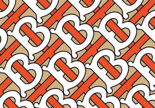
The new identity of Burberry is here, and it's more modern than ever. The brand new logo features an orange-red "T" in the middle of a "B." The print repeats, so that you're left with one, big abstract logo.
That's not all, either. The actual Burberry name is getting a brand new look too. While the original logo was written in serif font, the new one is written is sans serif, making it look a whole lot more modern.
According to the Riccardo Tisci's Instagram post, the logo was created by Peter Saville. The graphic designer and British art director is no stranger to high end brands. As PopSugar points out, Saville recently worked for Calvin Klein under Raf Simons.
"Peter is one of our generation’s greatest design geniuses. I’m so happy to have collaborated together to reimagine the new visual language for the house," Riccardo Tisci says of the logo, according to Burberry's tweet.
The decision to rebrand comes just five months after Tisci took over as Christopher Bailey as Burberry's chief creative office. This is the first time in almost two decades that the logo has been changed. The colors are the same, but the entire vibe is completely differet.
Tisci seems to be very excited about the logo change. He posted screenshots of the email conversations between the graphic designer and himself about the brand new look. From the colors to the lettering, he loves them all, according to the posts.
Believe it or not, the "T" in the interlocking "TB" design does not stand for Tisci. According to the chief creative officer's emails, the design as inspired by "a logo from 1908 and a Thomas Burberry monogram" that he found in the archives. So, yes, a lot of thought and time went into the creation of this logo.
The fonts are completely different than before, but the brand stayed traditional with the colors. There's no word on whether this print logo will be used on clothing or bags any time soon, but expect to see it everywhere because this change is for good.
There's a good chance that this logo will be the one to stick around for decades. Especially considering that the past logo was the same for around 20 years. It's normal that the brand's logo would get a tweak with the new chief creative officer stepping into the role.
Tisci posted two photos of the print and one of the new name on Instagram on Aug. 2. He then posted his email conversations to his Instagram Stories, before announcing that he was going on a vacation. It looks like all is well in the world of Burberry.
