News
If Jeb Bush's Logo Had Different Punctuation

Ahead of his expected campaign kickoff announcement on Monday, Jeb Bush tweeted out his 2016 logo on Sunday, and it looked pretty familiar: His first name in red on a white background, followed by an exclamation point. Social media descended quickly with criticism and analysis of the what and why of the image, poking fun of how else it could be interpreted, and many noted the former Florida governor has used nearly the same design through all his gubernatorial campaigns over the years. Depending who you asked on Sunday, that was a sign either of consistency and authenticity, or a sign of repetition and a lack of creativity.
It's only fair that the presumptive front-runner in the race for the GOP nomination have his logo scrutinized, because goodness knows everyone was all over Hillary Clinton's "H" logo when it was unveiled: The arrow points to the right, it looks like a FedEx logo, it looks like directions to a hospital, said social media types. But for all its possible flaws, Clinton's logo doesn't have punctuation. And, at the very least, the H logo looks different from the logo Clinton used in her 2008 presidential campaign, which we can't really say for Bush. But the exclamation point doesn't really give us much insight into the Bush campaign besides enthusiasm: He really wants to run for president!
How important is punctuation in a campaign logo? Well, if you change that excited exclamation point to another symbol, it creates a whole different meaning. Some of them might actually work better. Here's what Bush's 2016 logo might mean if the punctuation were different.
Question Mark: Are You Sure, Jeb?
A question mark is probably best avoided in any campaign logo, because the last thing he needs is to seem indecisive or uncertain. A question mark after his name might seem like Bush is asking himself, "Do I really want to run for president?" Probably not the image one wants from a potential commander-in-chief.
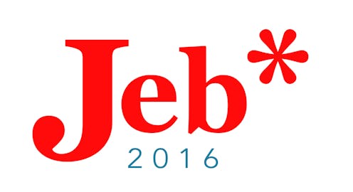
Asterisk: Is There A Footnote Here?
In scholarly texts, an asterisk usually suggests there's some qualifying information or extenuating circumstances to what you're reading, as if it means, "Vote for Jeb, but..." There are enough questions about whether Jeb is still in the shadow of his father George H.W. Bush and his brother George W. Bush, without his logo looking like there's some kind of weird footnote to his campaign for the Oval Office.
Parentheses: A Losing Proposition
On a balance sheet, numbers in parentheses indicate a loss, as do any figures in red. Since his campaign isn't even official yet, Bush knows better than to use a logo that conveys "loss" or "loser." Plus, it almost makes his name look like some kind of afterthought, which doesn't exactly scream "decisive."
Dollar Sign: It's What Campaigns Are About Anyway
This might not be the most subtle option, but Bush has money and needs money to keep his campaign alive, especially if he plans to go down to the wire with Clinton. It might be the most honest of all the logo variations, but it has the potential to alienate middle-class voters, who might not take kindly to being reminded of Bush's wealth and the money it takes to get ahead in politics.
An Ellipsis: Air Of Mystery Or Unfinished Thought?
An ellipsis could give the feeling of "there's more to come" or "to be continued," which could make the sort of bland Bush seem a little more intriguing. Then again, intrigue might give some voters the feeling that he's up to something, or that the mystery is one they won't like.
Hashtag: Trying Too Hard, Or Down With The Kids?
There's a fair chance that #Jeb will become a hashtag at some point during the campaign season (we have a long way to go, people), and all the candidates know they have to master social media. But a campaign slogan with a hashtag smells a little like desperation, a lame attempt to get yourself trending. This is why people hire social media teams, so the candidates can avoid looking like President Dad.
Quotation Marks: Is This For "Real"?
So, we all know "Jeb" is not his real first name (Jeb is short for John Ellis Bush), and this might be a funny way to call attention to that. It lets the readers feel like they're in on a joke somehow. But the flip side of that is that voters might not take too kindly to a candidate who puts his own name in air quotes (and he would probably have to do air quotes at every campaign stop).
Full Stop: End Of Conversation.
While it doesn't quite have the enthusiasm of an exclamation point, using a period or full stop could really give Bush that thing that candidates strive for in presidential elections: An air of inevitability. Putting the period at the end of his name is the visual equivalent of a mic drop. It's so obvious, that he has nothing else to say. Or, it's just the end of the conversation.
Images: Celia Darrough/Bustle (8)