News
I Tried The iPhone 6, And...
Full disclosure: due to several boring, mainly money-related reasons, I'm still on the iPhone 4S. So when I got to play with the brand-spanking new iPhone 6 for this review, well, I was excited. This phone — two whole generations (and a bit) after mine! — would feel totally different, I thought. It would make my current phone feel like a stodgy aunt, and I'd come to resent it, pining after the 6 in a way that would cause feelings of guilt and betrayal. I was worried, in fact, about how much I'd love the 6. Which just goes to show that you should never, ever raise your expectations too high.
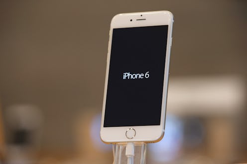
It's not to say that the iPhone 6 isn't beautiful. It is. Sure, the first thing you think when you see it is, Huh, that sure looks like a Samsung, but who cares? It's sleek, and thin, and ever so light. Certain details, like the glass of the screen curving inwards around the edges, make it softer and sexier than iPhones past. It makes you want to touch it, stroke it, turn it around and around in your hand.
Except you can't, because it's too big, so it just sits there. The display is clear and bright, dazzlingly so (it's about as far from the iPod touch as Todd Aiken is from Susan B. Anthony), but let's face it, you get used to the clarity of a new display within minutes. In fact, a lot of what's great about the iPhone 6 is just, well, underwhelming. Awesome? Sure. Worth the money difference from its Android counterparts? Probably not.
The Best
Let's start with what the iPhone 6 does right. First off, there's the revamped Spotlight feature, which almost makes up for the meh of everything else. Now, when you swipe down to get to Spotlight Search, it's not just your phone it'll look for — type in anything and you get a list of suggestions taken from the Web (including either a Wikipedia page or another suggested definition), from iTunes, from the App Store and even from your nearby locations. It makes it all super handy, and if I were to buy the iPhone 6, this would be major time-and-effort-saver.
Another time-saver? The phone's phenomenal loading speed. They weren't kidding about that three-times faster thing. Even rich content sites load quickly and seamlessly; you forget that you're on a phone, or that there ever was such a thing as slowly-loading blue navigation bar.
The Weird
One of the striking differences between the iPhone 6 and all iPhones before it is the use of predictive text. When you're typing a message, it'll do what many Androids and old keypad-phones have done before it: offer you a suggestion of three words, which you can press, so that you don't spell out the whole thing. One of those three options will often be more than a different word that starts the same way; it'll be something that commonly comes after. So if you've typed "How are you d", one of the suggestions will be, "doing." But instead of feeling innovative, the feature just feels like a throwback.
Another new feature? The "Reachability" function, that moves everything on your screen about halfway down. You just double-tap on the home button, and whoop, everything suddenly sinks. A nice — and as you'll find out, useful — idea, but kind of makes your phone look like it's got some scary virus.
The Bad
What's sad is that this iPhone's biggest innovation — its size — is also one of the most frustrating. It's just too big. It is. Not because of the pocket controversy — if you're an average size woman, it will probably fit into your jean pocket, and if you put it in lengthways, is potentially quite safe — but because it's just not comfortable to use.
Yes, it's possible to type one-handed, but it's awkward, like finger-gymnastics. It's close to impossible to get to the top right hand corner (which you need, for example, in order to cancel) — this is where the Reachability function comes in, but it feels like a lot of fuss for something that should be simple. You can't hold the phone properly, so the instinct is to rest it on your palm; but this, due the slippery design, feels super precarious.
Ultimately, what I found myself doing was balancing it in my left hand, and using an odd combination of my right index finger and left thumb in order to type. But it just didn't feel natural or intuitive, which is what Apple has always felt like in the past.
In short? My iPhone 4S has nothing to worry about.
Image: Getty Images
