I’ll be honest: I think the whole Pantone “color of the year” thing is silly. I do, however, agree that color can be useful for organizational purposes — even when we’re applying Pantone numbers to beer. In fact, I’ll amend that statement: Especially when we’re applying them to beer.
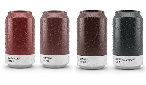
Spanish graphic designer Txaber created these conceptual beer bottles and cans as an exercise in package design. First, he matched nine varieties of beers ranging from the very dark to the very light with a Pantone number; then he designed a set of bottles and cans based around them that show you exactly what’s inside in a beautifully minimalistic fashion. As AdWeek points out, they’re in the same vein as the Beertone cards that debuted last year; while Beertone focused on representing to color values of each beer in HTML and other types of code, however, the Pantone packaging pares the exercise down to something much simpler: A drink, a color, and a number. Elegant, no?
For the curious, here’s what the entire set of cans looks like; check out the bottles, as well as close-ups of each individual item, over at Txaber’s website:
While we’re on the subject, these gorgeous little cans also perfectly illustrate why I prefer my beer dark and flat, as opposed to light bubbly. I mean, just look at the lovely rich colors the darker four beers have! How gorgeous is the red tone of the dark ale? How brooding and mysterious is the imperial stout? Don’t you just want to sink your teeth into the porter? I mean, they just look tastier, like coffee, chocolate, or cherries (which, incidentally, happen to be the undertones of some of my favorite porters and stouts). The pale ale, meanwhile? Looks kind of like Gatorade. Or, y’know, like a certain other fluid I could mention…but I’ll leave it unsaid. Even if I dislike pale ales, you’re perfectly entitled to drink them if you so desire.
See the whole series over at Txaber’s website; you can also check out more of his work, including a whole bunch of neat-o typography projects for brands like Absolut and Nike.
Images: Courtesy Txaber
