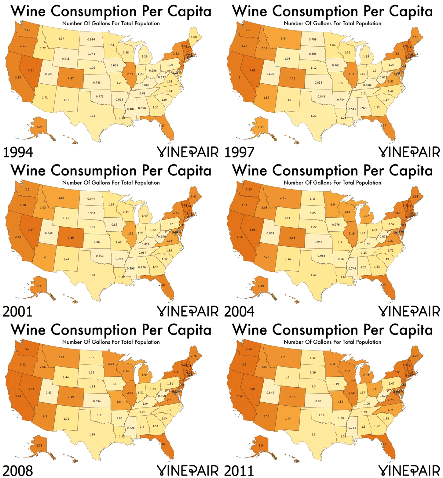
Break out the corkscrew and the stemless glasses, because we’ve got something to celebrate: According to this nifty graphic, wine consumption is up in the United States, which means we’re all getting a lot classier. Or something. Hey, anything's better than these nightmare drinks, right?
Okay, so maybe drinking wine doesn’t automatically turn you into Audrey Hepburn — but take a look at this anyway: Vinepair, a blog geared towards making the wonderful world of wine accessible to folks who may not know their Syrah from their Shiraz, has put together an animated map illustrating the growth in popularity of wine drinking over the past 20 years. It seems that in the years following a 1991 report on 60 Minutes about French diets and heart disease rates — y’know, the one that told us that red wine can help keep your heart healthy — wine sales in the U.S. jumped dramatically. Not only that, but they’ve been steadily on the rise ever since, both when it comes to imported wines and those from the 9,000 or so domestic wineries in the country.
In their analysis of the map, Vinepair points out an interesting trend that emerges if you watch closely enough: The Northeast and Florida have always been pretty big wine-drinkers; so have the wine-producing states on the West Coast (hey there, California!). The increase in wine consumption, however, “isn’t a story of the same-old-people just drinking more wine. Rather, it’s more people in more states drinking more wine.” Who knew?
Just don’t stare too long at this thing. It gets weirdly hypnotic after a while. Cheers!

<img width="800" alt="Change In Wine Consumption Per Capita In America Since 1994" src="http://vinepair.com/wp-content/uploads/2014/03/change-in-wine-cosumption-over-time.gif" height="576" class="article-body-image" title="Image: http://vinepair.com/wp-content/uploads/2014/03/change-in-wine-cosumption-over-time.gif"/>
