News
What Does This Logo Look Like To You?

On Sunday, Hillary Clinton's campaign to become president in 2016 finally, finally went live — and with it, we learned a lot about everything she's put together so far, including a pretty cool campaign video and redone HillaryClinton.com website. But nothing attracted attention quite like Hillary Clinton's campaign logo, which users on Twitter thought looked like all kinds of things, including a FedEx logo, directions to your nearest hospital, and so on. Only Montel Williams liked it. (Yeah, you read that right.)
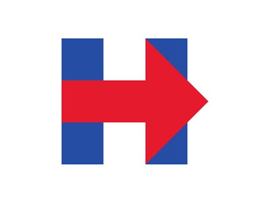
The logo is pretty clever: Shaped like a "H," it has two blue lines for the "H" (because, you know, Democrats) and a forceful red arrow (because, you know, change) running between the lines to finish the "H" shape. It's simple and effective, and it runs throughout the campaign materials featured on Clinton's newly-minted official website. The most emphasized quote on the website, signed by Clinton herself and presented in wide typeface, reads: "Everyday Americans need a champion. I want to be that champion." The arrow represents moving forward, presumably towards Clinton becoming that champion.
I mean, you can absolutely see how Clinton's campaign team got there. Blue for the Democrats, red for progression, H for Hillary — it's simple, clean, and effective; you could pretty much draw it yourself. But so far, the only person who's really into it is, weirdly enough, Montel Williams.
Hmm. Interesting.
Everyone else isn't quite so sure.
I'm not sure the logo is a blink-and-you-missed-it indication that she's not going to be left-leaning, TBH, guys.
Image: Hillary Clinton